Thursday, December 12, 2013

Christmas Card

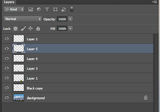
For this Christmas Card I put on a red background with the paint tool. Then I learned how to cut the snowman and christmas tree out using the quick selection tool and the magic wand tool. I also cut out a hat and layered it on top of the snowman to give him a hat. The next thing I did was put in some text. I used a christmas looking font to say "merry christmas!". I used a handwriting font for the back of the card to put my name and information on it as a copy write. I learned how to make snow look like its falling using a black background, then I added noise. I blurred the noise to make it look more vertical and like it's falling instead of just dots. Then to erase the black I added a screen filter. To make the snow look more dimensional I copied the layer and rotated it 180 degrees and increased the blur even more this helped make it look like bigger flakes and like some snow was falling faster than others. The last thing I did was to add a drop shadow to the writing, the snowman, his hat, and the christmas tree so they were more visible.

Tuesday, December 10, 2013

Grunge Portrait


I made this grunge portrait using two layers. I turned my photo to black and white, then I increased the contrast. Next I converted the photo to water color. Then I added channels and inverted the picture so the bottom layer would show through and look slightly grungy. Then I used a grunge brush and I colored over the picture using many different vibrant colors.

Thursday, December 5, 2013

Old Gruene Hall

In this picture I used the same techniques as the first one. I applied an inner glow using the color burn blending mode. I next did a hue and saturation change by placing the hue at 35, the saturation at 20 and the light at 18. I added an adjustment layer. I applied three covering layers that made it look more old fashioned and gave some wear and tear.

Old Picture

This is an old picture done with three steps.

Monday, December 2, 2013

My grinch Cube

Malerie and I with my Grinch cube.

The Grinch


I copy and pasted all of these picture from photoshop into the boxes. Then I fitted them into their own squares.

Thursday, November 21, 2013

Bluebonnets

With this picture I extended the picture using the cloning tool. I created a paper banner using a pattern and the lasso tool. I put a blue sky for a background, created brads by making a circle and embossing it.  I did the same thing for the text as well.

Monday, November 18, 2013

clone tool


 For these pictures I used the cloning tool. I repositioned the tool constantly to achieve the disappearance of the footprints, dog, and young girl. I also repositioned it often so the photoshopped image was as real looking as possible.


Friday, November 15, 2013

drop shadow

For this project I used multiply blending mode to create the drop shadow image of the darker blue and pink. I also turned the opacity down to 66%.

lene flare

For this picture I used a lens flare with about 56% brightness. I used the lens type of 50-300mm zoom. I placed the light right above the tree to look like a sunrise or sunset. the last thing I did was use the blending mode of screen over a black layer to eliminate the black and achieve the look I did on this picture.

Thursday, November 14, 2013

Opacity and Blending Mode

I put the opacity at 69 and used the blending mode called lighten to achieve this look from the two layers.

understanding blending mode

I used the screen blending mode to turn the black square pink and the grey square a lighter pink.

Wednesday, November 13, 2013

PTA Reflections

I chose each of these pictures to show that my family, friends and my boyfriend are a major source of inspiration. Bethany Hamilton is also someone who inspires me to never give up even though the future looks bleak. God is also a major source of keeping my head up high.  It is important to never lose inspiration and keep on believing.

Thursday, November 7, 2013

Guess Who Cards


I made these Guess Who cards based off of the three main characters from the Harry Potter series. I chose a red background because that looked best for all the characters. The color of the text that I used for their names goes with the color of their ties for their uniform. I made sure to use the same font for each name.